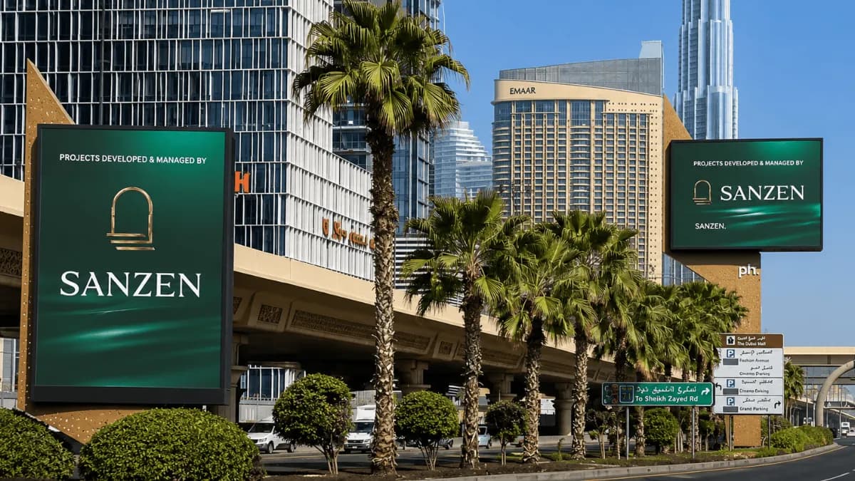
The UAE real estate developer has kept the campaign clean and simple. Its name takes up most of the screen, supported by its gold logo and a short message explaining the company’s role.
The latest activity follows Sanzen’s first UAE outdoor campaign, which appeared in November 2025. Instead of introducing a completely different look, the developer has continued with a similar design and message.
For a growing property brand, this consistent approach can help people become more familiar with the Sanzen name each time they see it.
Sanzen Keeps Its Brand at the Centre
The most noticeable part of the campaign is the SANZEN name.
It appears in large white lettering across a dark green background. The company’s gold architectural-style logo sits alongside it.
Above the name is a simple message:
“PROJECTS DEVELOPED & MANAGED BY”
The wording tells audiences what Sanzen does without filling the screen with additional information.
There are no property renders, long lists of features, or several different messages competing for attention.
Instead, the developer itself becomes the focus.
This approach makes sense for an awareness campaign. Someone who sees the screen can quickly identify the company, even if they do not have enough time to read detailed information.
A Simple Design Creates a Premium Look
Sanzen has used a dark green background throughout the creative.
The white brand name stands out clearly against it, while the gold logo adds a premium touch.
The colour combination also fits naturally with the property sector, where developers often want to communicate quality and confidence.
The design includes only a few main elements:
- Sanzen’s large wordmark
- The gold company logo
- A short description of its role
Keeping these details smaller allows the Sanzen name to remain the first thing people notice.
For billboard advertising, a clear visual order can make it easier for audiences to understand the main message while travelling.
Sanzen Continues the Look of Its Previous Campaign
The new campaign does not represent a major change in direction for Sanzen.
Its colours, branding and overall style are similar to those used when the company first appeared across UAE outdoor media in November 2025.
That consistency is important for a relatively new name in the property market.
Changing the design completely every time could make it harder for people to connect one campaign with another. Keeping recognisable colours, logos and messaging gives each appearance a familiar feel.
Someone who noticed Sanzen previously may recognise the dark green and gold branding when they encounter the latest campaign.
Over time, these repeated visual cues can help strengthen awareness.